The Last Enemy That Shall Be Destroyed Is Death

His wand rose into the starting position for the Patronus Charm.
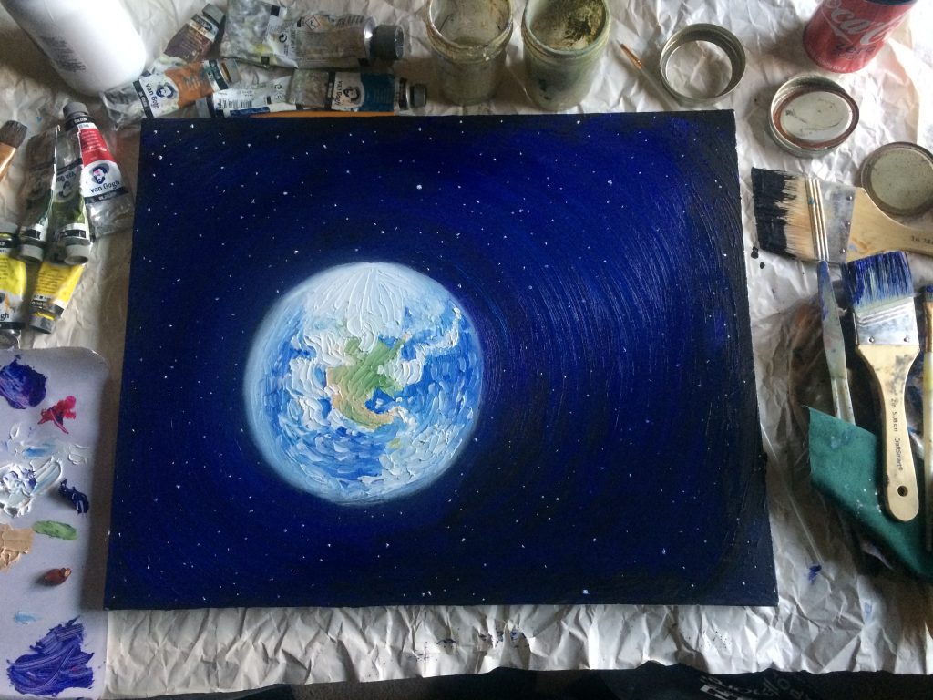
Harry thought of the stars, the image that had almost held off the Dementor even without a Patronus. Only this time, Harry added the missing ingredient, he’d never truly seen it but he’d seen the pictures and the video. The Earth, blazing blue and white with reflected sunlight as it hung in space, amid the black void and the brilliant points of light. It belonged there, within that image, because it was what gave everything else its meaning. The Earth was what made the stars significant, made them more than uncontrolled fusion reactions, because it was Earth that would someday colonize the galaxy, and fulfill the promise of the night sky.

Would they still be plagued by Dementors, the children’s children’s
children, the distant descendants of humankind as they strode from star to star? No. Of course not. The Dementors were only little nuisances, paling into nothingness in the light of that promise; not unkillable, not invincible, not even close. You had to put up with little nuisances, if you were one of the lucky and unlucky few to be born on Earth; on Ancient Earth, as it would be remembered someday. That too was part of what it meant to be alive, if you were one of the tiny handful of sentient beings born into the beginning of all things, before intelligent life had come fully into its power. That the much vaster future depended on what you did here, now, in the earliest days of dawn, when there was still so much darkness to be fought, and temporary nuisances like Dementors.

On the wand, Harry’s fingers moved into their starting positions; he
was ready, now, to think the right sort of warm and happy thought. And Harry’s eyes stared directly at that which lay beneath the tattered cloak, looked straight at that which had been named Dementor. The void, the emptiness, the hole in the universe, the absence of color and space, the open drain through which warmth poured out of the world. The fear it exuded stole away all happy thoughts, its closeness drained your power and strength, its kiss would destroy everything that you were.

I know you now, Harry thought as his wand twitched once, twice, thrice and four times, as his fingers slid exactly the right distances, I comprehend your nature, you symbolize Death, through some law of magic you are a shadow that Death casts into the world.
And Death is not something I will ever embrace.
It is only a childish thing, that the human species has not yet outgrown.

– Eliezer Yudkowsky, “Harry Potter and the Methods of Rationality“; Chapter 45, “Humanism, Part III”


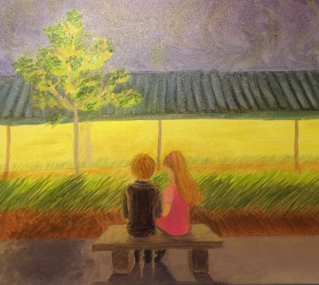
I already talked about why HPMOR is my favorite book on the planet. (Which is why I tried very hard not to spoil anything terribly important with the above excerpt, while still having it convey the intended meaning. I would love it if you’d read it.) Now, here’s an oil painting inspired by it. The title of this post, and of the painting itself, are inspired by a thematically similar section later in the book.

I had a bit of trouble finding decent reference pictures for ‘earth from space’, funnily enough. It’s difficult to distinguish high-quality photographs from digital art. The references (yes, plural) I ended up settling on were taken from NASA and the ISS. Even so, maybe it doesn’t matter, since I ended up using a pretty impressionistic style anyway.

I’ve actually never drawn space or planets before. I would absolutely not trust myself to be non-detail-focused enough to do this in markers, hence the painting. (Also, since this is my warm happy thought as well as Harry’s, I want to hang this on my wall, and oil paintings are better for that.) It was an interesting experiment to try and loosen up enough to draw something from such a high level, especially when my brain was busy making me think thoughts like “okay just remember that if you move your brush in slightly the wrong way you’ve erased the entire state of Texas”. As you zoom out more and more, you have to suggest more and more stuff with subtle brush techniques, and when the things you’re suggesting are on the order of entire states or countries… it gets moderately stressful.

Still, I think it came out alright. I’m pretty happy with the color of the ocean, and the general texture of the clouds. The space was both the easiest and the most fun part, starting with a black gesso and painting over it with blues and purples. I may touch this up later, but it’s good for now.

As a final note: Unlike the rest of my paintings on this blog, this one is not for sale. I’m happy to make a copy if you’d like one (which includes making modified versions, ex., with the U.S.S. Enterprise in the foreground); for details on making commissions, visit my Commission Me page.

r e l a x


At last, another art post. I was listening to some data analysis lectures to add data science to my repertoire, and since I need something to do with my hands when I listen to audio, I doodled this.

Since motivation unfortunately never comes pre-packaged with inspiration, I needed some of the latter. In my search, I came upon this excellent prompt site. If you so happen to be an advanced artist looking for inspiration, this may be for you. I selected an “elaborate” prompt; these seem to give you not only ideas about subject and/or situation, but also hints about color schemes and/or art style. I’ve never seen something so cool (or useful!) from an art prompt generator before. Anyways, the prompt I was given went something like this: “Reflect the emotion of rolling thunder in the distance. Use a Renaissance art style.”

Well, for the emotion, I’m honestly not sure how I went from “distant rolling thunder” to “rooftop swimming pool at dawn”, but heck, they convey the same emotion to me, anyway.

For the art style, though, I’ve never tried to do anything “Renaissance” before. My standard art style is vaguely Impressionistic but mostly anime, so I was wondering what the hallmarks and techniques of Renaissance painting were. After I figured that out, I’d figure out how on earth I was going to do that using markers.

It seems to me that the end result was vaguely Impressionistic, mostly anime, and with a hint of Renaissance. Some of the hallmarks of Renaissance paintings are strong dark/light contrast and several layers of glazes to create fuzzy outlines around things. I tried pretty hard to use a consistent color scheme but to use contrast as much as possible. The subject is mostly light-colored, with the exception of his hair and eyes, which are dark. A strip of light, washed-out yellow contrasts the warm greys of the surrounding pool deck. The opaque glass in the railing contrasts with the dark rails. Then, those rails contrast with the bottom of the sky (light), which itself contrasts with the top of the sky (dark). Even the water, which might otherwise be uniformly colored, contains shades from pure white to prussian blue. (Note: I used no black in this piece, just very dark greys, blues, and browns. This is in keeping with the style of most classical painting.) Lastly, for the fuzzy outlines, I simply didn’t bother to outline each form in pen (technique for cartooning called “inking”). I allowed the marker colors to bleed lightly into each other.

The end result was a kind of post-modern realism with a charming conflict of light source. Enjoy.

The Painter On His Way to Paint

For this piece, I copied this Van Gogh painting for the most part. However, I decided that I would add in Van Gogh himself, on his way to paint the piece.

To properly represent both Van Gogh’s painting and likeness, I wanted to do a copy not only in subject matter but in art style and technique. As such, I painted this in oils using a palette knife (like the one on the right in this pic). In total, I only used two tools for this: a palette knife, and the small paintbrush I used to sign it.

I worked back-to-front: I painted the sky first, followed by the distant landscape, then worked forward until I finished with Van Gogh himself. Since things in the back are overlapped by things in the front, I painted the things in the back first and painted the closer things over top of them.

Painting Van Gogh in there was hard, but not for the reasons you might think. I’m very solid at figure drawing, so drawing a human was pretty easy. The problem arose from trying to paint Van Gogh in his own style, when he wasn’t a central part of the piece. He did self-portraits (actually he did tons), but he painted himself as the center of those pieces. Here, I was trying to paint him small, as almost an afterthought.

As such, I tried to copy Van Gogh’s style of drawing figures, with not a lot of success. At first I did him in the style of his self-portraits, but it was too detailed and realistic. I was very happy with this first version artistically, but it didn’t fit so I scrubbed it out. I tried to get some vibrant highlights and shadows in the second version, but that still didn’t quite fit stylistically. Finally, I just blocked in some color and gave it an immensely simple white outline where the light was coming from. That seemed to do it, so that’s the finished version.


This painting is for sale! Get it now for $250 plus shipping. If you’re interested, contact me!

View From the Bicycle Café

Bicycle Café, North Park, PA

For my painting class, I had to go around town and do five “thumbnail sketches” of landscapes. Only one of those sketches would be used to do a landscape painting, which was the next assignment.

This came out of one of the sketches my professor rejected.

11pm, First St.

A selection from a recent painting of mine. WordPress wouldn’t let me upload the full photo so I had to crop it 🙁

I met my fiancé at a convention in Baltimore, at one of the last events of the second day. After it was over, we couldn’t find anything else to go to or do, so we walked through the rooftop garden. Eventually we ended up sitting on a concrete bench at the edge of the sidewalk, looking into the cloudy sky. We sat together and talked until it started raining.

This is painted mostly from my memory and partially from the few photos I found of the Baltimore Convention Center rooftop garden (it’s a shame there aren’t more; it’s beautiful). Originally I tried to draw this with markers, but it wasn’t working the way I wanted, so I decided to pull out the oil paints and paint it instead.